This is the review I wrote of the team we had to critique for our first peer wise assessment last Tuesday. We reviewed team 13, who you can find here: Lu-man Riches.
-------------------------------------------------------------------------------------------------------------------------------
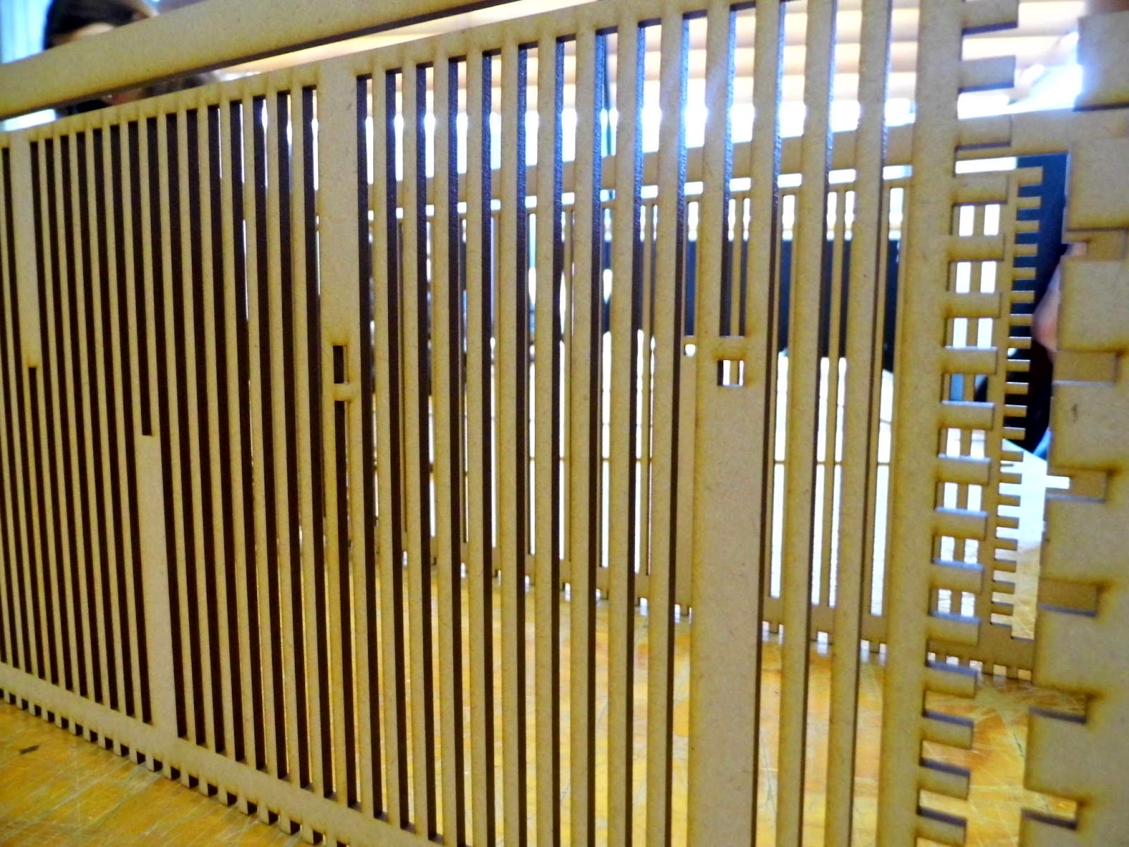
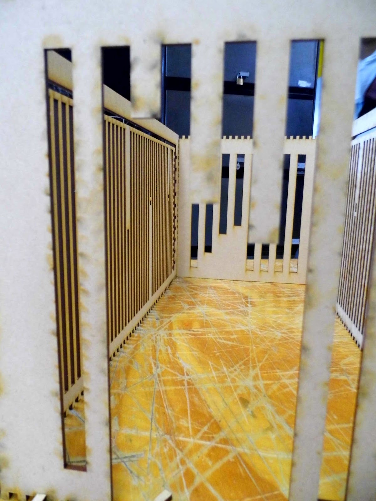
What is a city? This question rang as fundamental in my mind as I observed Lu-man-Riches work, Ultimate City. The interesting textures, small blotches of colour and unique use of quadrilateral collage immediately grabbed my attention, but something that I found infinitely more interesting was the way that the three pieces looked at the idea of a city, how it was concrete, cramped and artificial, and how this had a very dystopian feel to it.
Their first piece, a section, focused on materials, and the gap between the past and the present. Influenced by J.G. Ballard’s novella of the same title as their overall work, this section alluded back to the story with the presence of cars, sitting on front of the building as if abandoned. The building also appeared abandoned, and there was no human presence in this image, as if there was a lack of life in this dystopian world. However it was the textures of this image really caught my eye. Materials, Eman Al-azi, one of the architects from Lu-man-Riches informed me, show emotion. The materials of the building were dark and appeared wrecked. Paint ran down over the windows. The windows themselves displayed normal, even happy looking interiors, however these were blurred, to symbolise that they were something of the past. The materiality of this image suggested that this dystopian city had not always been this way, and the warm colours of the blurred window scenes emphasised this, emitting an atmosphere of something better, something happy.
In contrast, the final two pieces of Lu-man-Riches work appeared far from happy. At first glance these two images appeared rather gloomy with their high contrast on grey scale. However, they have a secret. Throughout the images there are small areas that remain coloured, poignant reminders that there is in fact something else to this city: it is not just a desolate, empty space. These colours emphasize the idea that there are utopian elements within the dystopian environment. Although at first glance it just appears to be a bleak, industrialised space, these colours remind us of the hope for a utopia. This idea is not obvious at first glance, so it helps to hold the attention of the viewer, who must then pose more questions on the very nature of a dystopia and utopia. Can there ever be just a dystopia or a utopia? Does one have parts of the other?
Furthermore, the use of collage in the form of squares as tiny components creating clouds added a detailed element to the images that added an intriguing quality to the images. These drew my attention and gave the space an overall more playful and friendly feel, which might make visitors more inclined to visit a place that seems so dreary and cheerless at first glance. This attention to detail will come in very useful for Lu-man-Riches future work and they are already researching obscure materials for two hotels, which they have been commissioned to design in the city and on a natural island site. This project relates back to this work, Ultimate City, but will focus more on the difference between an urban and a suburban area, with cities being industrialised and artificial, and suburbs being green and organic. Lu-man-Riches architects, Eman Al-azi, Alicia Lin and Richard Fiftia, expect to have completed the designs by November this year. If their designs have nearly the thought that went into Ultimate City, they will undoubtedly be very good. I await them with anticipation.