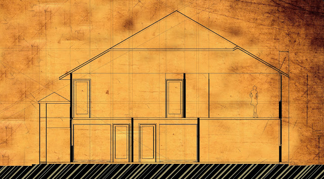
If you haven't already figured it out, these are the same sections as the last post, just inverted! I like them a lot better like this to be honest, which is weird since blue is my favourite colour so you'd think I'd be drawn to the blueprints more... anyway, we ended up using neither these nor the last images, just the line work of the section since we wanted to annotate, and overlay the elevations with tracing paper.


No comments:
Post a Comment