Showing posts with label Design 3 (ARCHDES 200). Show all posts

Monday, 3 June 2013

Model nets


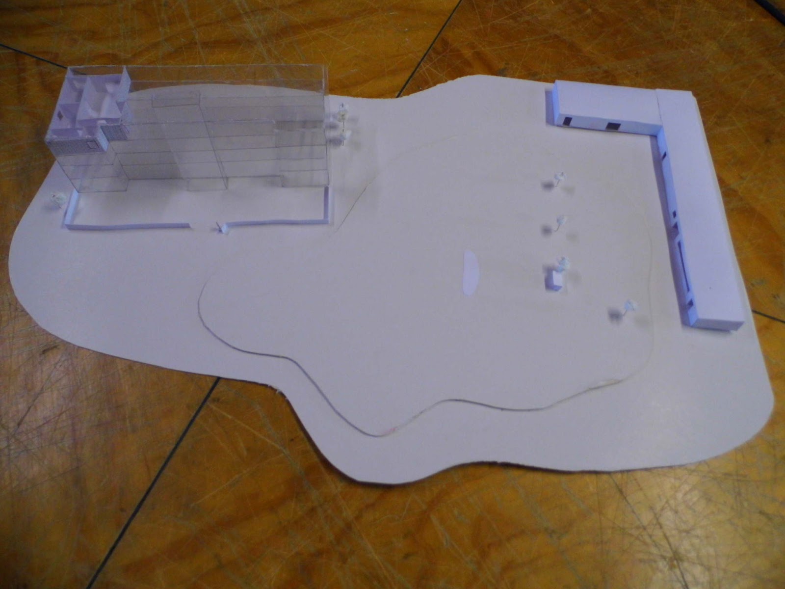
These were the nets I created in order to construct my models. The top one took me 6 hours to fold together, it was at 1:500 and sooo fiddly! The bottom one wasn't so bad, it was just one single unit at 1:100.

Final Crit Semester 1, 2013

Hello world, after a semester of hardly posting I am back to update... now that it is the day after my final crit I actually have the time!

So, about my final crit- it went really well, I think. Or at least I feel confident in what I presented. Unfortunately I can't show you the models yet because I didn't take a photo of them before they went in for moderation, but I think they're pretty cute to be honest! A teeny tiny version of my building complex and another teeny tiny floor plan model of one unit. They were so fiddly, they were really difficult to fold up... (the 1:1000 building took 6 hours just to fold!) I'll post photos once I am able to take them.

Here are my A0 pages for now, anyway!


So shall I explain my design? OK- so basically, our site is a real site in Onehunga, Auckland, currently owned by Housing New Zealand. They proposed putting a series of units on the site, however the local community is quite opposed to this plan, as they feel it will tamper with the unique quality of the site.

The site is indeed quite amazing: there are three main things that I picked up from visiting it.
1) How quiet it is- considering that it is right next to a bustling commercial hub including Auckland's Dressmart outlet mall, this is quite amazing. I would say that the most prevailing sound was birdsong, which I thought was quite lovely!
2) The fact that lots of people had their doors wide open: this shows that this must be a rather tight-knit community with a lot of trust and openness amongst neighbours.
3) The amount of vegetation, and the residents interaction with it: cute tree huts, steps cut into trees and a fair few immaculately kept gardens were seen in the general area... and on the site itself there is a small corn field and a bunch of banana trees! These are quite unusual to find in such abundance in an urban area... and I was really exited by this!

One of the main things I wanted to retain with my design was the ability to continue planting... so I created a plan devised of the meandering street map, and placed car parking underground, with a series of light wells illuminating it. 

There are a maximum of three levels of units (27 units in total) and the upper levels can be reached by walking on the curving, grassed roofs of the lower levels. There are also Photovoltaic cells in place on these roofs (since PV cells actually work better on green roofs, as they help regulate temperature) and rain gardens throughout the complex, mitigating storm-water run-off an encouraging the community to foster and tend to their growth.

Since the roofs are curved, there are of course areas in the corners of the curve where the ceiling heights will be to low to be occupied. I have devised 4 different types of uses for these spaces:
1) Light wells: these can provide light to neighbouring units and/or the underground car park.
2) Storage: especially useful for things such as bicycles, which would be annoying to store inside the units.
3) Services: piping etc. can be hidden in these 'useless' spaces.
4) Children's play houses: as children are, of course, much smaller than adults, they can fit in these areas, and enjoy them. This also encourages socialisation between the children throughout the complex.

In terms of acoustics, I took one unit and designed it in detail. This was the unit on the north side of the site, and would be ideal for three flatmates. The wall between separate units is solid concrete, with timber studs and insulation on the inside. The exterior wall is identical, except it also has a weatherboard cladding on the outside: this not only enhances the natural theme by being a natural (wooden) material, but also fits into the typology of the suburban architecture of the area, which features many weatherboard-clad typical NZ villas. For the interior walls of the units, there are two types: for acoustically protected areas GIB Fyreline walls are utilised, and for non-acoustically protected areas (such as bathrooms etc.) GIB walls (without Fyreline) are employed. Moreover, the placing of units throughout the complex has been deliberate: I have tried to place the corridor of one unit next to the joining of the one next to it. That way, it acts as a buffer zone for noises between units.


Thursday, 9 May 2013

Green roofs

I quickly photoshopped one of the photos of my 1:500 site response model to illustrate how I imagined the building bulk to appear: almost like habitable hills.

1:500 site response model


Photos of my 1:500 concept model of the site. This shows the building elements being torn from the ground, with the roof of the one story elements acting as a garden/ balcony of the two story elements.

Site response


One thing that I really took away from the site was the amount of vegetation, and the relationship the residents in the area had with that vegetation, e.g. impeccably kept gardens, tree houses, ladders in trees, a corn field and banana tree plantations... these are all aspects I want to keep. Therefore, with my design, I am focusing on making it appear as if the units are growing out of the ground, and creating trellised spaces for plants to grow on and to act as a transition space between indoors and outdoors.
Site Analysis


Concept models in detail


My three concept models focus on networks. Concept model 1 focuses on a spiderweb, and the pathways within. Concept model 2 focuses on streets, and the possibility of folding a form of organisation onto itself. Concept model 3 focuses on the pattern within the patter, looking at a street network at various scales, and seeing how much detail is revealed with each shift.

Saturday, 13 April 2013

Mid term crit

I rearranged my previous A0s for our mid term crit and printed this- which is about 400mm longer than a standard A0 page. It is huuuge, and apparently when I was carrying it back to studio it looked like I was carrying a tube taller than I am!
Anyway, I fixed up some mistakes that were previously on my sheets, so hopefully the mid term crit goes well!

Sunday, 7 April 2013

T.E.F.S.C.A. Improvements


We took our precedent (our dwelling, in my case my apartment) and went about improving it. First, I identified the problems with T.E.F.S.C.A., then loaded the current construction materials on the Insul software to see what their STC ratings probably are. Then, I looked at the apartment in terms of organisation, and did two bubble diagrams, one for the current situation and one for the ideal situation. Looking at the ideal situation, I devised an improved plan.
Then, taking from the research I acquired from a variety of sources cited on the bottom right on the page, I added improvements to the apartment, mainly in terms of acoustics, but also in terms of comfort and socialisation. I focused mainly on material quality and details.
For our mid-term crit, I will be fixing this page up. Although I got good feedback for my presentation, there are a few things I would like to add, and a couple simple things I wish to change, e.g. some details to the plan and I need to darken some of the text for legibility purposes.

Concept model 1


For my first context model, I was looking at spider webs. What I find really interesting about spider webs is the fact that no matter what size they are, they are always functional (unless the spider is silly and builds the web in a stupid place...) they can also come in all sorts of different shapes, e.g. the Funnel Web spider makes a kind of pod like web.
The coloured strips were me just exploring different possible paths. There are an almost infinite amount of paths that can be taken throughout the web, and maybe they have different functions, or are used by different people.
I made this out of a sushi mat, rubber bands, card, PVA and spray paint. I was really thinking about junctions and connections, and their abstract nature.

T.E.F.S.C.A. Site Model


I finally brought my camera into studio and took pictures of the full site model. This shows the wee model of our apartment in context with the full building and site, including the bus stop and shops across the road.

Wednesday, 3 April 2013

T.E.F.S.C.A. sections


Just a close up of the individual sections I made in the second week of my apartment, since the actual page I posted previously is quite large, and things seem small on it even when enlarged!

Tuesday, 19 March 2013

Home analysis

So along with our model (which is now massive... I have yet to photograph it in its entirety, it fills up my entire locker...) we produced an A0 page (I swear, the page sizes get bigger each year... next year I bet it will be 2A0!) analysing our house, mainly concentrating on the acoustics, material qualities and the distance to public places to express citizenry.  I'm really loving this paper so far!

Monday, 11 March 2013

T.E.F.S.C.A.


So for our fist project this year we are looking at our own dwelling as a precedent. So- this is a wee card model at 1:100 of my apartment... which my flatmates and I decided to name T.E.F.S.C.A... (it stands for The Epic Flat of Supreme Classy Awesomeness hahaha it's a bit embarrassing admitting that online...) this is just a small part of what will this apartment, shown in it's location in the overall building, in site context, with the closest space for an expression of citizenry (like a café, or another public area) expressed, so the proximity between them is clear. There is a lot of work to!

Saturday, 9 March 2013

Architektia Logo

Firstly, I made it to second year! Yay! That means I'm just over 1/3rd of the way through my BAS now. Anyway, I don't have much time to write since I have A LOT of work to do... but since one part of my work is, of course, presenting things (on an A0 sheet, gasp... so huge! We seem to work on bigger paper every year! To think I used to think A3 was big...) I decided I should make myself a logo, since of course I can no longer use the Studio L.I.M. one since I am no longer working with Manu and Andy. Therefore I spent a few minutes fiddling around on Illustrator (which I am getting better at... but I am still terrified of it and run back into Photoshop's arms whenever I can...) and came up with this. My initials are highlighted, this blog is advertised, and I can easily change the colour depending on the overall colour scheme of whatever I am working on so I'm pretty happy with it. The only thing that is frustrating me a little right now is the fact that the eye (or at least my eye...) immediately jumps to the second 'i' (the eye jumps to the i... hahaha... yeah, it's past midnight and I'm exhausted). I guess that's just because your brain registers SUDDEN NEGATIVE SPACE since I'm pretty sure I got the spacing between the letters right... well anyway, it will do. Clearly, I'm only a perfectionist to the point of laziness!

In other news, I'm really looking forward to Design 3. We got to pick our studio topics this year, something I was really excited about! I got my first choice too- Dermott McMeel and George Dodd's paper on High Density Architecture, Acoustics, and expressions of Citizenry. I really enjoyed our first studio- we visited the Acoustics Centre and got to enter the Reverberation Chamber and the Anechoic Room! They were both incredible to experience, but especially the latter... it is -12 decibels inside, and at the time it was built, was the quietest room in the world. I found it slightly uncomfortable... when I first entered I felt pressure in my ears as if I were descending on a plane, and once the lights were switched off all I could feel was the pressure of my feet on the ground... since I had been left with only 3 senses. Such an amazing and interesting experience!