Sunday, 31 March 2013

The lady in the Red CoAt


One of my finished renders  from media this year. We're designing for Madelon Vriesendorf, the wife of Rem Koolhaas, who collected many items. Each week we get a new image from her collection to add to our work, and this week it was the lady in the coat.

Also, I have quite a lot of work, particularly from this class, to upload but I've been very busy lately... I'll get to it eventually.

Tuesday, 26 March 2013

Vintage Sections


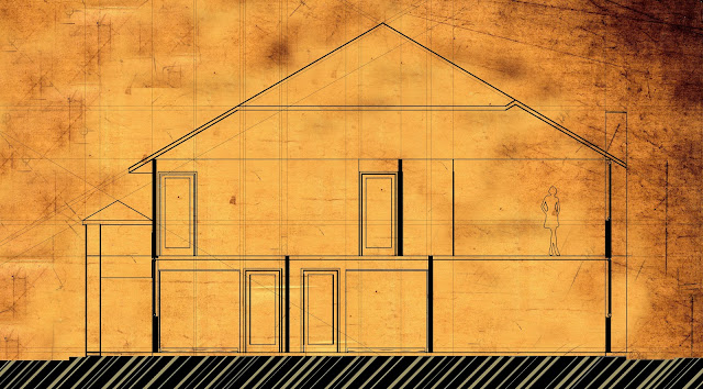
If you haven't already figured it out, these are the same sections as the last post, just inverted! I like them a lot better like this to be honest, which is weird since blue is my favourite colour so you'd think I'd be drawn to the blueprints more... anyway, we ended up using neither these nor the last images, just the line work of the section since we wanted to annotate, and overlay the elevations with tracing paper.

Saturday, 23 March 2013

Blueprint sections


Sections of Karen's house for our project. We are meeting tomorrow, so I'm not yet sure if these are the final sections, as I still need to get feedback off the others about the appearance. Of course, the main thing for this project is the information conveyed, so we will mostly be working on annotations tomorrow. Anyway, I first modelled Karen's house on ArchiCAD (which was quite tricky, her house is rather large and on a slight slope, so it was hard to think through as I've only been there once so far!) and then I edited the sections I took off that on Photoshop and Illustrator.

Tuesday, 19 March 2013

Home analysis

So along with our model (which is now massive... I have yet to photograph it in its entirety, it fills up my entire locker...) we produced an A0 page (I swear, the page sizes get bigger each year... next year I bet it will be 2A0!) analysing our house, mainly concentrating on the acoustics, material qualities and the distance to public places to express citizenry.  I'm really loving this paper so far!

Wednesday, 13 March 2013

Pandoratech

Hey there, just letting you know that I have another blog running now for work related to one of the assignments for ARCHTECH 208. This is group work, so the blog posts will not only be by me, but also by my team mates, Mandy, Jenny, Karen and Alicia. Also, don't forget that this blog is my number 1 spot to show work, so I'm definitely not abandoning it! Anyway, if you want to check the new blog out its address is http://pandoratech.blogspot.co.nz/ although there is nothing on it yet... 

Monday, 11 March 2013

T.E.F.S.C.A.


So for our fist project this year we are looking at our own dwelling as a precedent. So- this is a wee card model at 1:100 of my apartment... which my flatmates and I decided to name T.E.F.S.C.A... (it stands for The Epic Flat of Supreme Classy Awesomeness hahaha it's a bit embarrassing admitting that online...) this is just a small part of what will this apartment, shown in it's location in the overall building, in site context, with the closest space for an expression of citizenry (like a café, or another public area) expressed, so the proximity between them is clear. There is a lot of work to!

Saturday, 9 March 2013

Architektia Logo

Firstly, I made it to second year! Yay! That means I'm just over 1/3rd of the way through my BAS now. Anyway, I don't have much time to write since I have A LOT of work to do... but since one part of my work is, of course, presenting things (on an A0 sheet, gasp... so huge! We seem to work on bigger paper every year! To think I used to think A3 was big...) I decided I should make myself a logo, since of course I can no longer use the Studio L.I.M. one since I am no longer working with Manu and Andy. Therefore I spent a few minutes fiddling around on Illustrator (which I am getting better at... but I am still terrified of it and run back into Photoshop's arms whenever I can...) and came up with this. My initials are highlighted, this blog is advertised, and I can easily change the colour depending on the overall colour scheme of whatever I am working on so I'm pretty happy with it. The only thing that is frustrating me a little right now is the fact that the eye (or at least my eye...) immediately jumps to the second 'i' (the eye jumps to the i... hahaha... yeah, it's past midnight and I'm exhausted). I guess that's just because your brain registers SUDDEN NEGATIVE SPACE since I'm pretty sure I got the spacing between the letters right... well anyway, it will do. Clearly, I'm only a perfectionist to the point of laziness!

In other news, I'm really looking forward to Design 3. We got to pick our studio topics this year, something I was really excited about! I got my first choice too- Dermott McMeel and George Dodd's paper on High Density Architecture, Acoustics, and expressions of Citizenry. I really enjoyed our first studio- we visited the Acoustics Centre and got to enter the Reverberation Chamber and the Anechoic Room! They were both incredible to experience, but especially the latter... it is -12 decibels inside, and at the time it was built, was the quietest room in the world. I found it slightly uncomfortable... when I first entered I felt pressure in my ears as if I were descending on a plane, and once the lights were switched off all I could feel was the pressure of my feet on the ground... since I had been left with only 3 senses. Such an amazing and interesting experience!